

Design
INTO-ON
E-Mail | into@into-on.com
Tel | 02-2285-2506
Web | into-on.com
Designer | Mi young Kim
Exhibition
The Korean Congress of Radiology
Location | COEX
Period | 2025.09.24~2025.09.27
Booth Size | 36(㎡)
Exhibitor
Dasol Life Science
web | www.dasolltd.co.kr
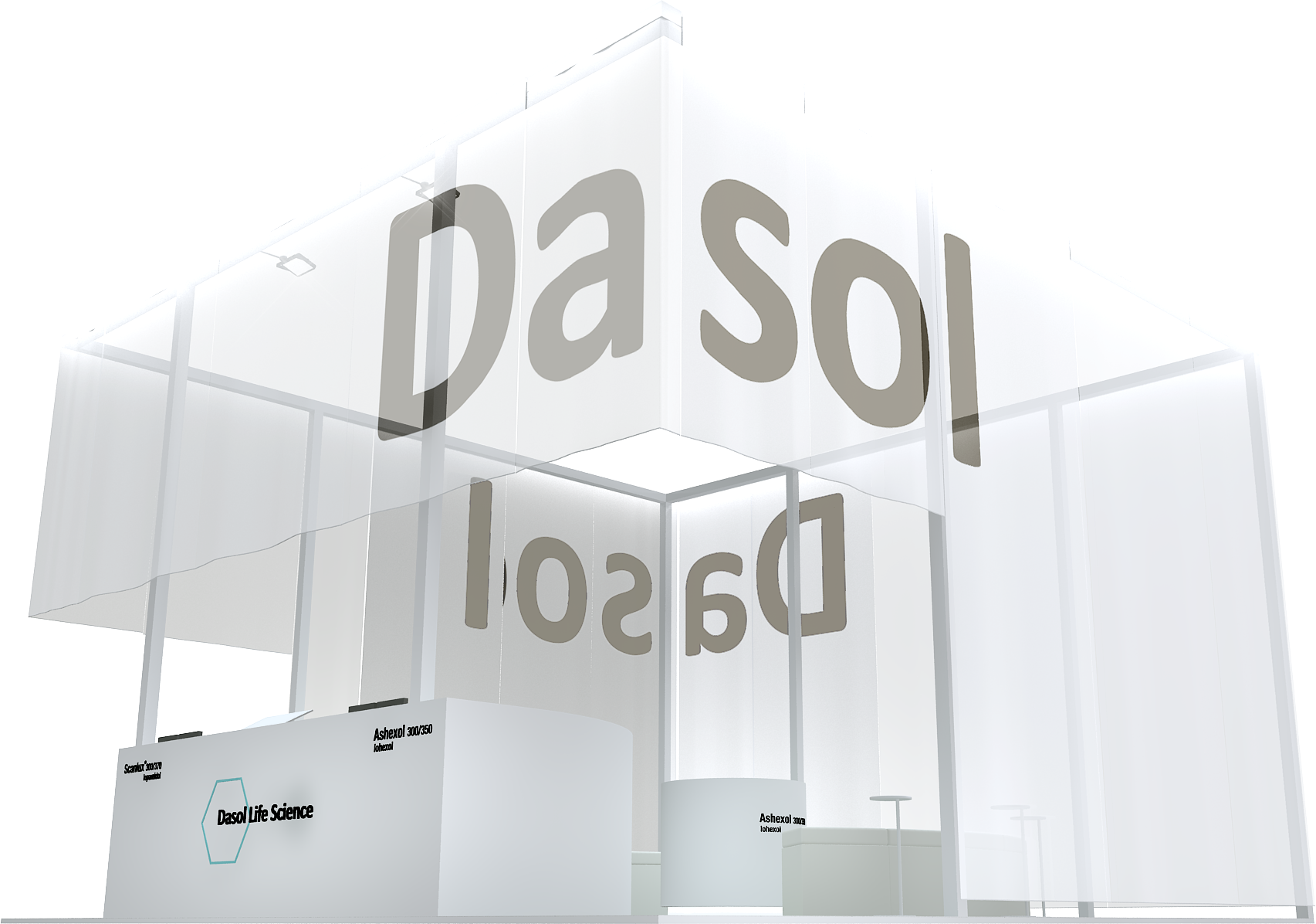
전시 공간은 구조물과 장식 요소를 최소화하여 제품과 공간에 시선이 집중될 수 있도록 계획하였습니다.
메인 구조는 스틸 프레임을 적용해 구조적 안전성을 확보하고, 최소한의 구조만으로 개방형 공간을 구성하였습니다. 외곽에는 반투명 패브릭을 적용하여 내부 공간에 대한 시각적 호기심을 유도하였으며, 공기의 흐름에 따라 자연스럽게 움직이는 패브릭의 특성을 활용해 별도의 기계 장치 없이도 공간에 변화와 움직임을 연출하였습니다.
The exhibition space was designed with a minimal structural framework and decorative elements to direct visitors’ attention toward the products and the space itself. The main structure utilizes a steel frame to ensure structural stability while creating an open-plan environment with the minimum required framework. A translucent fabric enclosure was applied around the perimeter to generate visual curiosity about the interior. The lightweight fabric responds naturally to airflow, creating subtle movement within the space without the use of mechanical devices, while serving
as an integral design element.
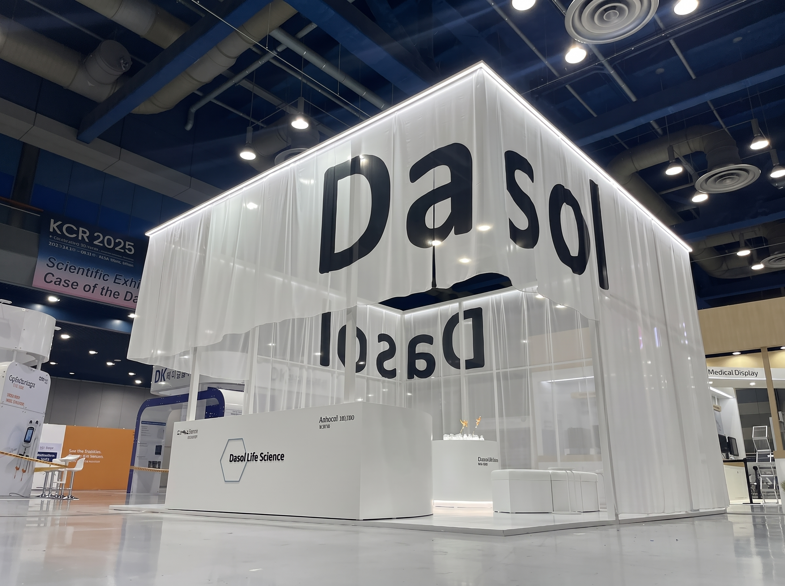
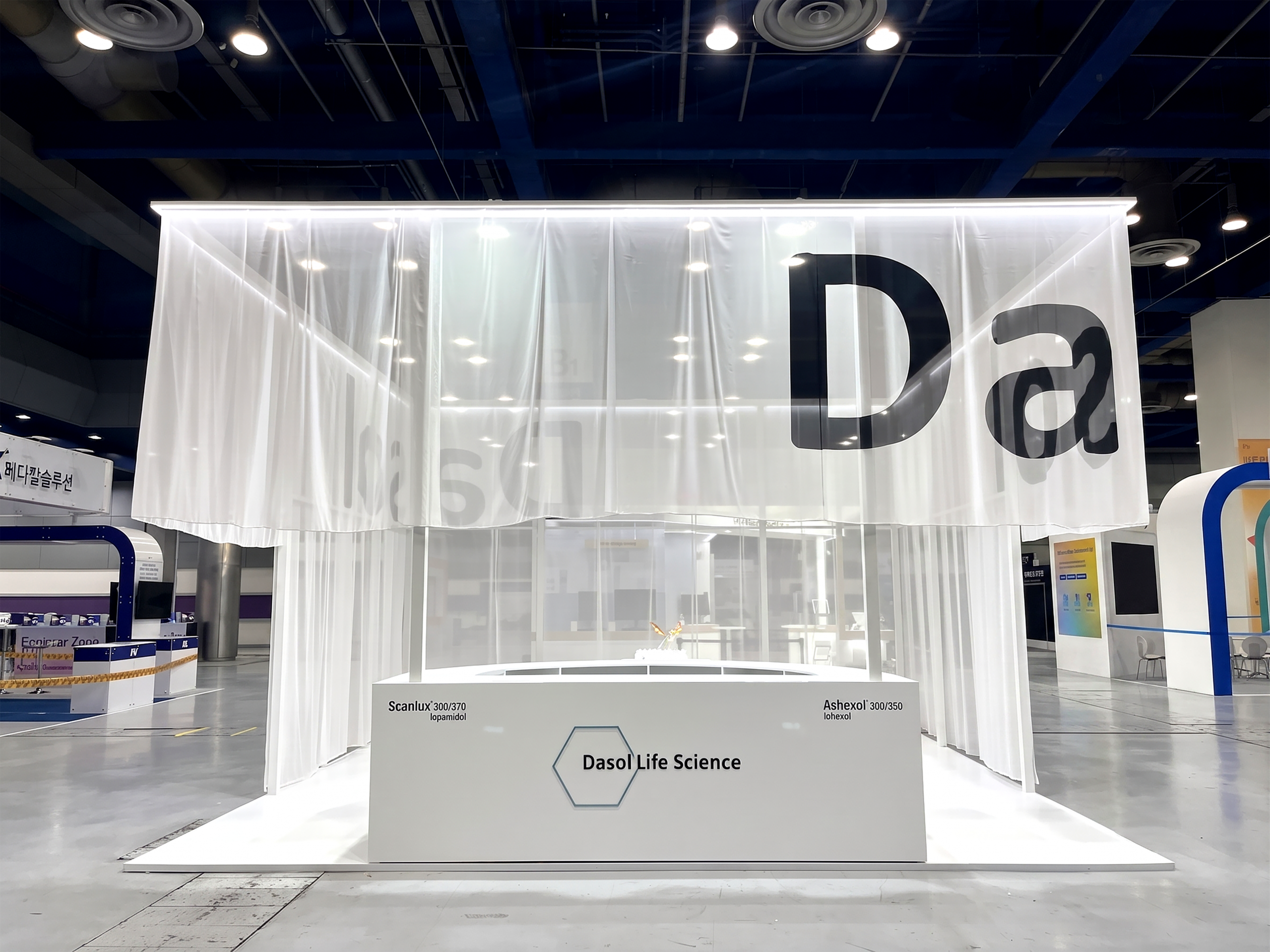
부스 전면 우측에서 바라본 전경으로, 간결하고 절제된 공간 구성 속에서 반투명 패브릭의 소재 특성이 공간의 주요 디자인 요소로 적용되었습니다. 최소한의 구성만으로도 소재의 질감과 투과성을 효과적으로 표현하여 전시 공간의 분위기와 개성을 확인할 수 있는 이미지입니다.
Front-right view of the booth, showcasing a clean and restrained spatial composition in which the translucent fabric serves as a key design element. With only a minimal number of design elements, the texture and transparency of the material are effectively expressed, highlighting the atmosphere and distinctive character of the exhibition space.
주요 마감재는 반투명 패브릭을 적용하여 내부 공간을 완전히 차단하지 않으면서 전시 공간의 일부가 은은하게 드러나도록 구성하였습니다.
패브릭은 공간을 구획하는 동시에 내부에 대한 시각적 관심을 유도하는 역할을 합니다. 제품 패키지는 화병으로 활용하여 별도의 오브제를 사용하지 않고 제품 자체를 공간 연출 요소로 적용하였습니다. 화려한 컬러의 꽃 장식은 화이트 톤으로 구성된 공간에 시각적 포인트를 제공하며, 방문객의 시선이 자연스럽게 제품으로 이어질 수 있도록 계획하였습니다.
The primary finishing material is a translucent fabric that partially reveals the exhibition space while maintaining a subtle visual separation. The fabric functions as both a spatial divider and a design element, encouraging visual curiosity about the interior. Product packaging was repurposed as flower vases, allowing the products themselves to become part of the spatial display without the need for additional decorative objects. Vibrantly colored floral arrangements provide a visual accent within the predominantly white space while naturally drawing visitors’ attention toward the displayed products.
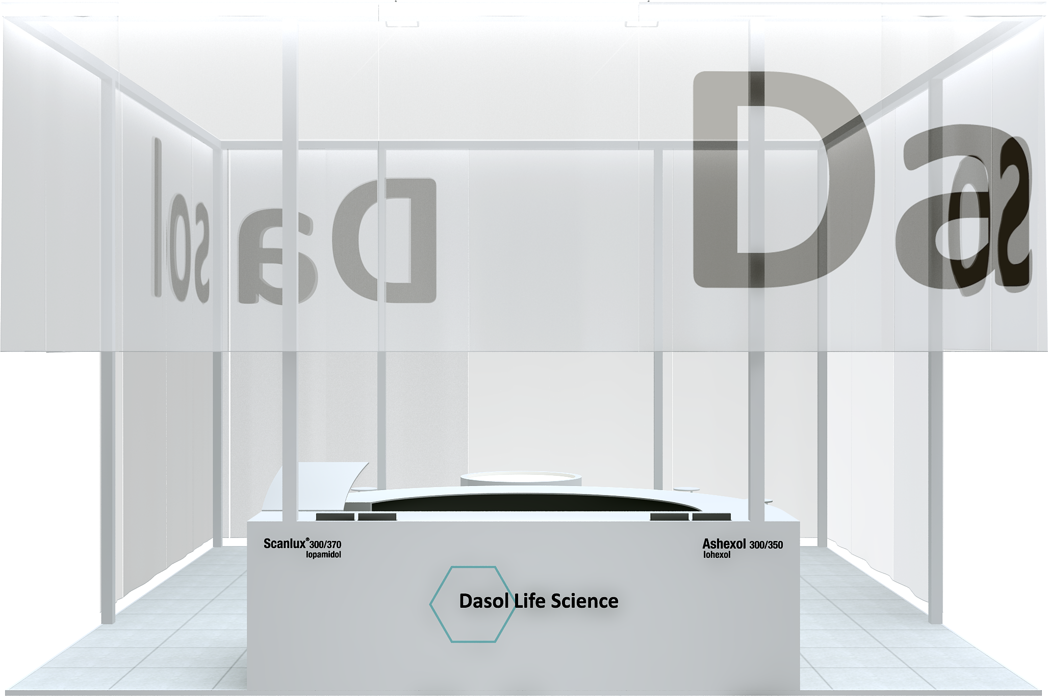
부스 전면에서 바라본 이미지로, 방문객을 맞이하는 리셉션 공간을 전면에
배치하여 접근성과 안내 기능을 강화하였습니다. 개방적인 공간 구성과 함께 자연스러운 진입 동선을 계획한 모습을 확인할 수 있는 이미지입니다.
Front view of the booth, showing the reception area positioned at the entrance to welcome visitors and improve accessibility and visitor guidance. The open spatial configuration was designed to create a natural and intuitive circulation path into the booth.
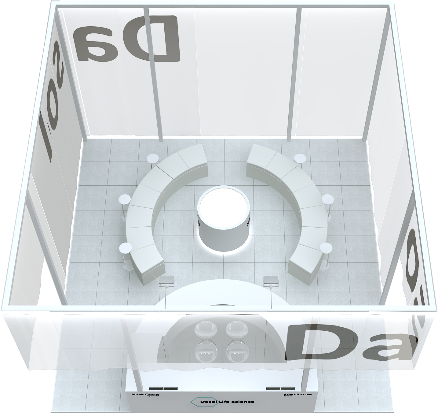
부스 공간의 대부분은 방문객을 위한 제품 관람 및 휴게 공간으로 구성하였습니다.
제한된 면적에서도 여러 명의 방문객이 동시에 머무를 수 있도록 충분한 휴게용 가구를 배치하여 제품을 여유롭게 살펴보고 자연스럽게 휴식할 수 있는 환경을 계획하였습니다. 전체 공간은 소규모 갤러리와 같은 분위기를 연출하여 관람에 집중할 수 있도록 구성하였으며, 주요 제품은 부스 중앙에 배치하여 어느 방향에서 진입하더라도 제품이 시각적 중심이 되도록 동선을 계획하였습니다
The majority of the booth was dedicated to product viewing and visitor lounge areas. Despite the limited footprint, ample seating was provided to accommodate multiple visitors simultaneously, creating a comfortable environment where they could view the products at a relaxed pace while taking a break. The overall space was designed to evoke the atmosphere of a small gallery, encouraging visitors to focus on the exhibits. The featured products were positioned at the center of the booth, ensuring they remained the primary visual focal point regardless of the direction from which visitors entered, while naturally guiding circulation throughout the space.
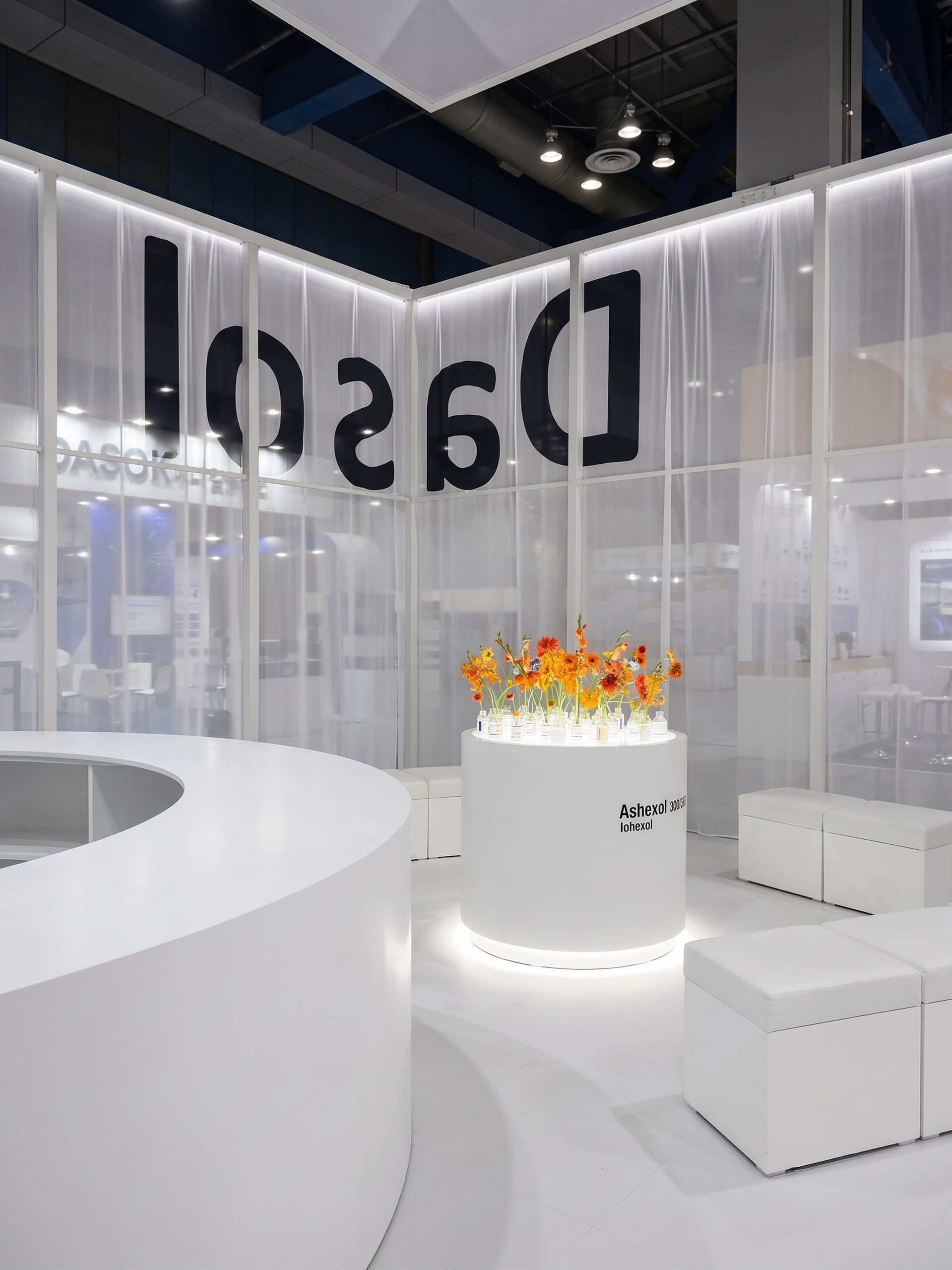
모든 구조물과 마감재를 화이트 톤으로 계획하여 공간 전체에 통일감을 부여하였습니다. 절제된 색채 구성을 통해 시각적 요소를 최소화하고, 제품 전시 공간이 자연스럽게 강조되도록 연출한 모습을 확인할 수 있는 이미지입니다.
All structural elements and finishing materials were unified in a whitecolor palette to create visual consistency throughout the space. Therestrained use of color minimizes visual distractions and allows theproduct display area to be naturally emphasized.
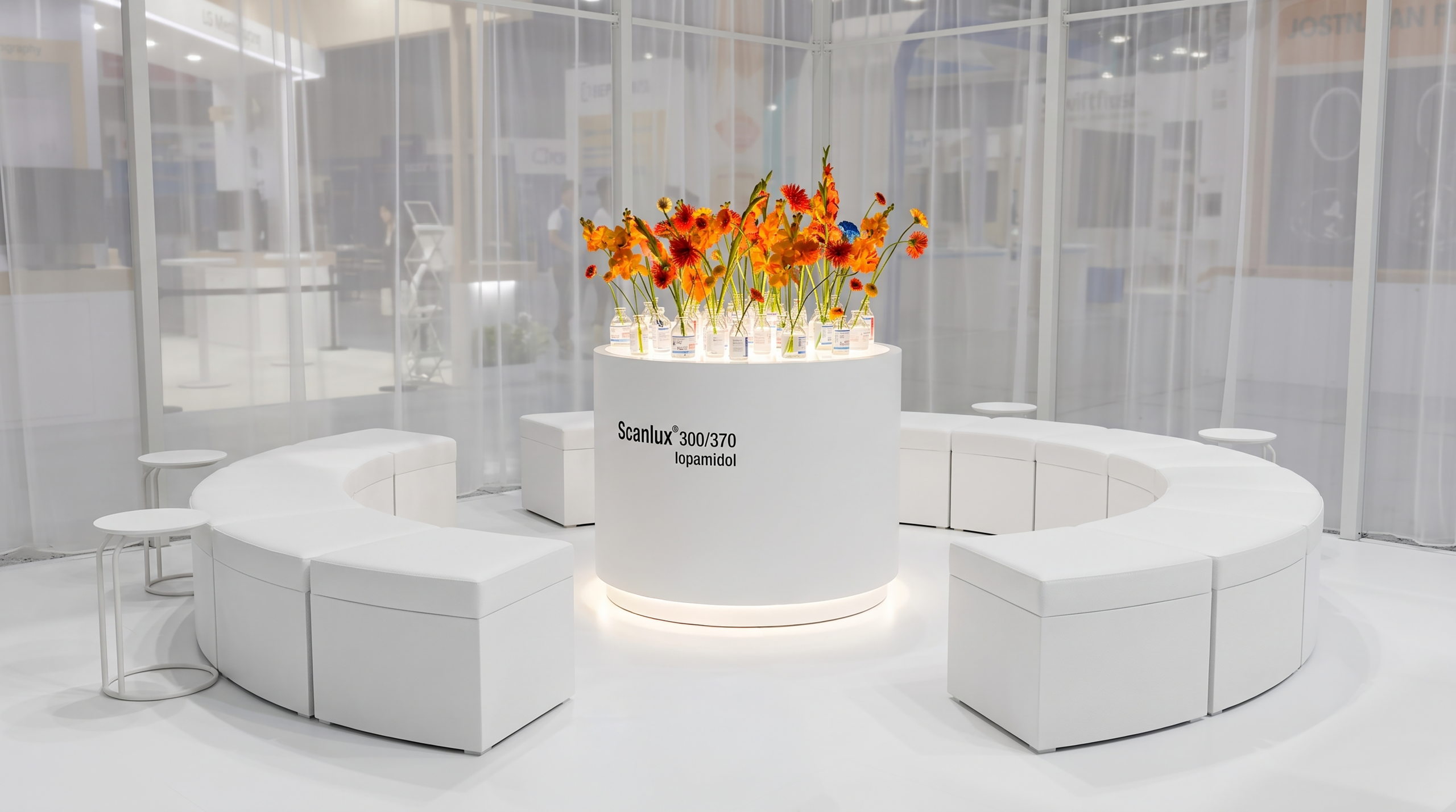
제품 전시대와 휴게용 가구는 모두 곡선 디자인을 적용하여 공간에 유기적인 흐름을 형성하였습니다. 곡선 형태는 방문객의 시선을 자연스럽게 부스 중앙으로 유도하며, 제한된 공간에서도 동선이 유연하고 원활하게 이어질 수 있도록 계획하였습니다.
Both the product display stands and lounge furniture feature curved forms, creating an organic flow throughout the space. The curved design naturally guides visitors’ attention toward the center of the booth while enabling smooth and intuitive circulation, even within the limited exhibition area.