

Design
a Design Group Co., Ltd
E-Mail | aspace@agroup.kr
Tel | 02-323-2090
Web | https://agroup.kr
Designer | An Gwanjoon
Exhibition
Chinaplas 2026
Location | NECC
Period | 2026.04.21 ~ 04.24
Booth Size | 160(㎡)
Exhibitor
SK Chemicals
web | www.skchemicals.com
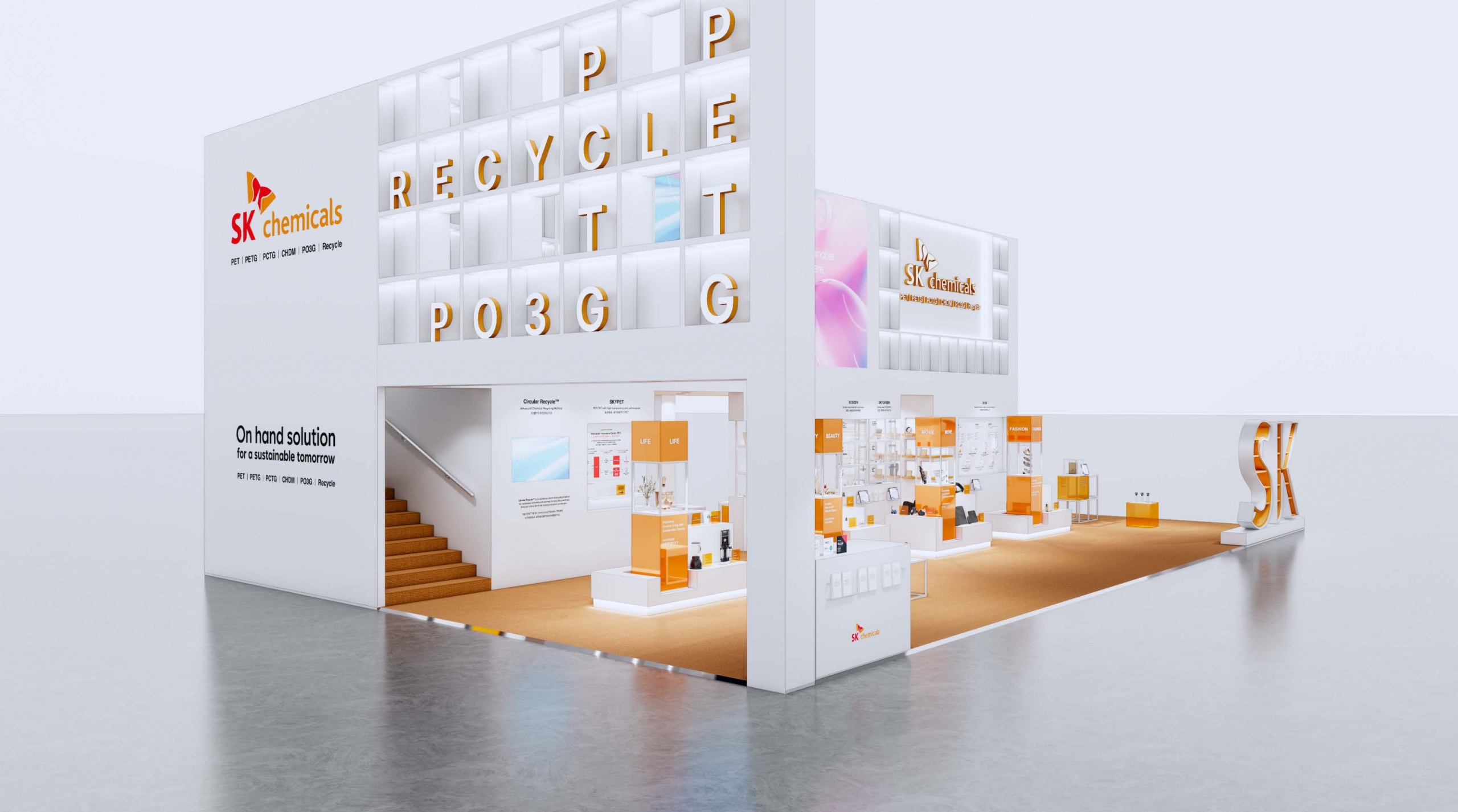
차이나플라스 2026 SK케미칼 홍보관은 ‘On hand Solution for a Sustainable Tomorrow’를 중심 메시지로, 6개 소재 솔루션과 5개 적용 분야를 하나의 ‘SK 기술 아카이브’로 집약하였다.
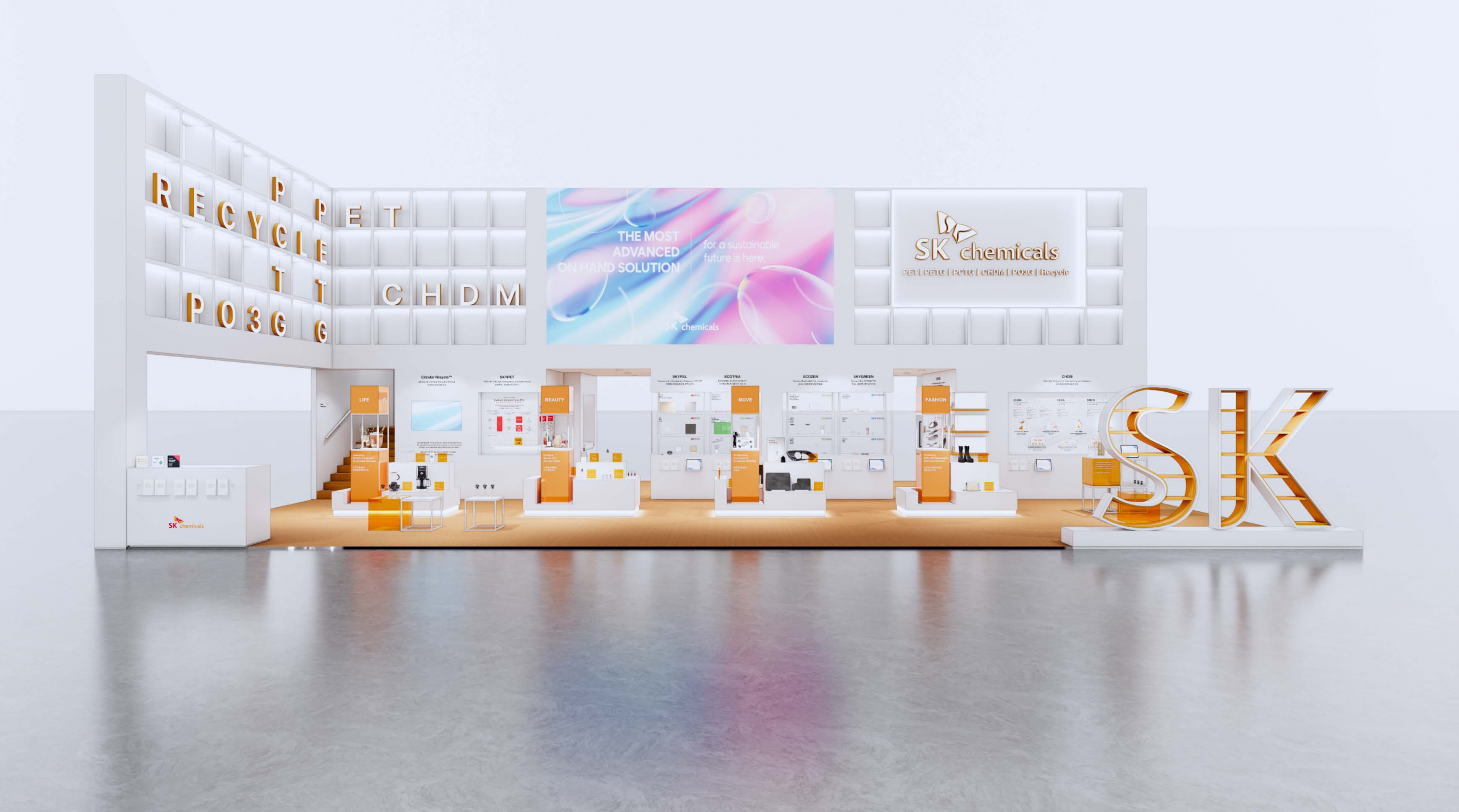
6m 높이의 복층 파사드에 백라이트 큐브 그리드, 대형 LED 미디어월, 입체 CI를 결합해 SK케미칼이 축적해 온 기술 체계와 전문성을 명확히 드러냈다. 또한 투명 아크릴과 시야가 관통하는 개방형 전시 구조를 적용해 소재의 특성과 적용 범위를 직관적으로 보여주고, 기술 정보의 신뢰성과 소재가 지닌 투명성, 지속 가능한 확장 가능성을 공간 전반에 전달하였다.
The SK Chemicals pavilion at CHINAPLAS 2026 brings together six material solutions and five application fields within a single “SK Technology Archive,” guided by the central message, “On hand Solution for a Sustainable Tomorrow.” The six-metre-high, two-storey façade combines a backlit cube grid, a large LED media wall, and three-dimensional corporate identity logo to present SK Chemicals’ accumulated technological expertise as one integrated system. Transparent acrylic and open-frame display structures reveal the characteristics and application scope of the materials, while conveying technical credibility, material transparency, and the future expandability throughout the space.
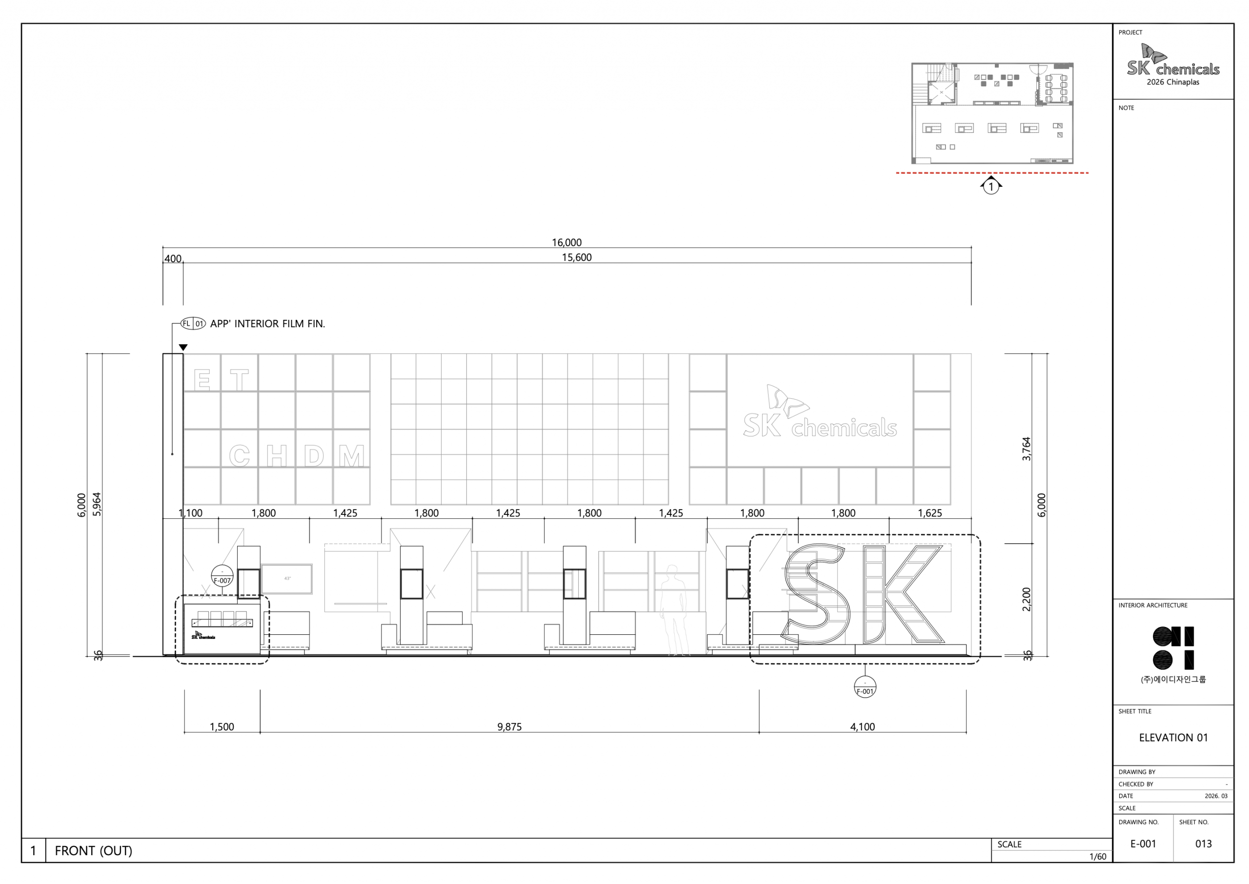
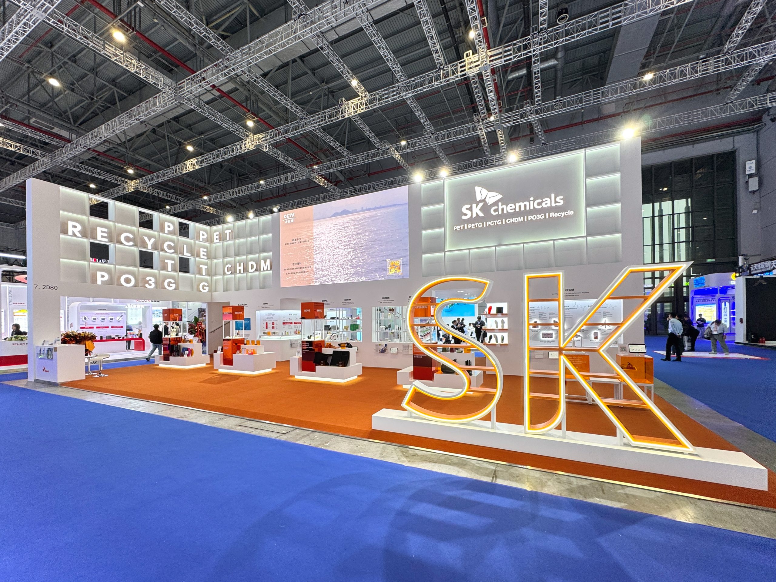
모듈형 큐브 파사드와 대형 LED 미디어월을 중심으로 구성한 복층 전면에 대형 SK 입체 조형물을 배치해, 원거리에서도 브랜드와 전시 정체성을 즉각 인지할 수 있는 랜드마크로 구현하였다.
An oversized three-dimensional SK structure stands in front of the two-storey façade composed of a modular cube grid and a large LED media wall. Integrated with the booth’s architectural language, it creates a landmark that communicates the brand identity and exhibition presence from the main aisle.
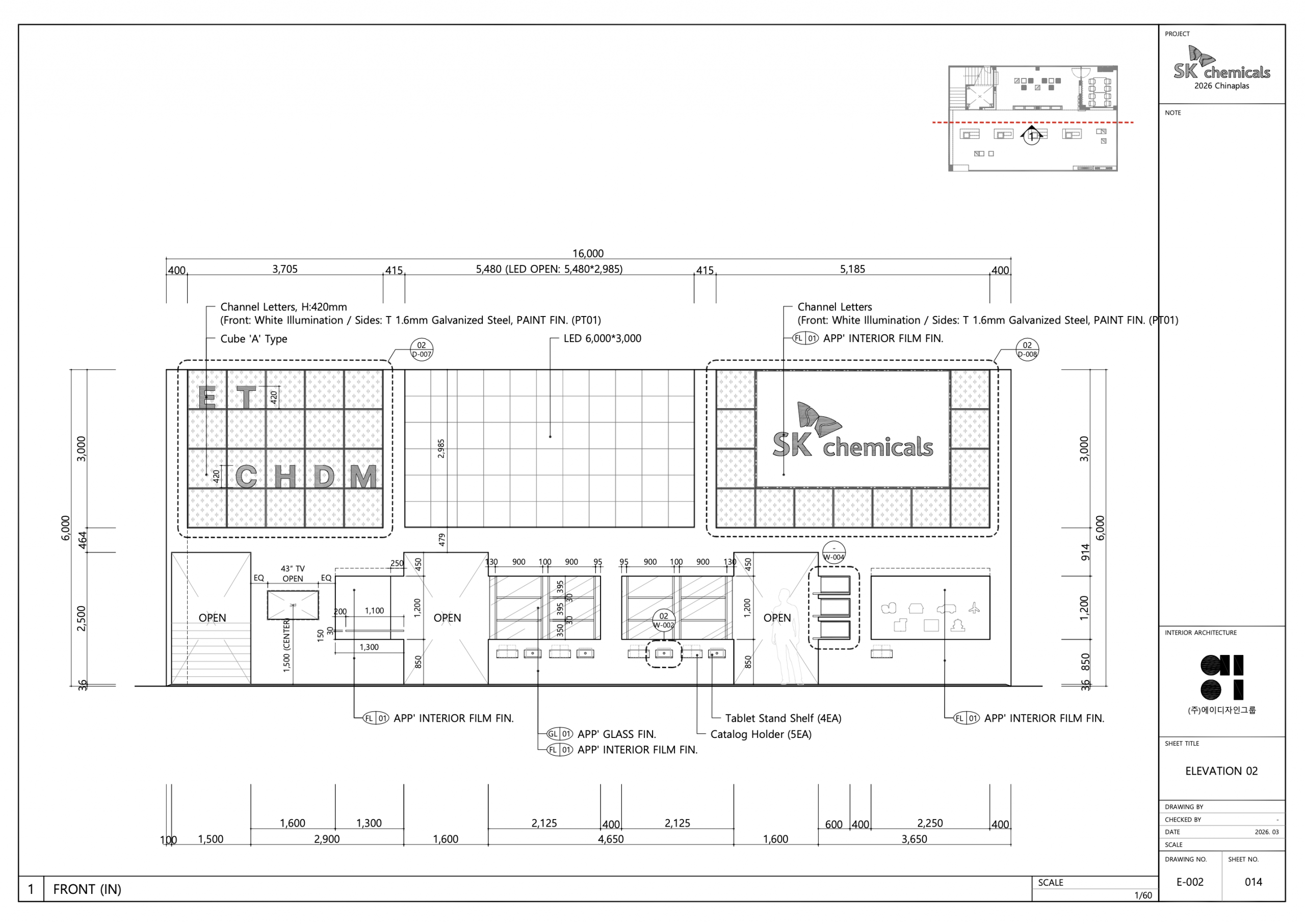
복층 파사드 중앙에는 브랜드 영상과 지속가능성 메시지를 송출하는 대형 LED 미디어월을 배치하고, 주변은 모듈형 큐브 구조로 구성하였다.
큐브 파사드에는 주요 기술 키워드를 가로와 세로로 교차 배치한 워드 퍼즐형 타이포그래피를 적용해 원거리 주목도와 콘텐츠 탐색의 흥미를 높였다. 전면에는 파사드와 동일한 조형 언어를 적용한 대형 SK 입체 조형물을 설치해 공간과 일체화된 브랜드 랜드마크를 구현하였다. 하이라이트 전시대에는 오렌지 컬러 필름으로 마감한 투명·반사 패널과 내부 조명 선반을 적용해 제품의 형태와 표면 특성을 강조하였다. 중앙 전시대는 시야가 관통하는 오픈 프레임 구조로 제작해 제품의 가시성과 공간의 개방성을 높이고, SK케미칼 소재가 지닌 투명성과 확장성을 공간적으로 표현하였다. 또한 보는 각도에 따라 이미지가 전환되는 렌티큘러 패널을 통해 브랜드 메시지를 직관적으로 전달하였다.
A large LED media wall is positioned at the centre of the two-storey façade to display brand content and sustainability messages, while the surrounding elevation is constructed as a modular cube grid. Key technology terms are arranged horizontally and vertically in a word-puzzle typography system, increasing long-distance visibility and encouraging visitors to explore the content. At the front, an oversized three-dimensional SK structure adopts the same modular design language as the façade, creating a brand landmark integrated with the overall architecture. The application highlight displays combine transparent and reflective panels finished with orange-coloured film and internally illuminated shelves to emphasise each product’s form and surface qualities. The central displays use visually permeable open frames to improve product visibility and spatial openness, expressing the transparency and scalability of SK Chemicals’ materials. Lenticular panels that change images according to the viewing angle provide an additional, intuitive channel for communicating key brand messages.
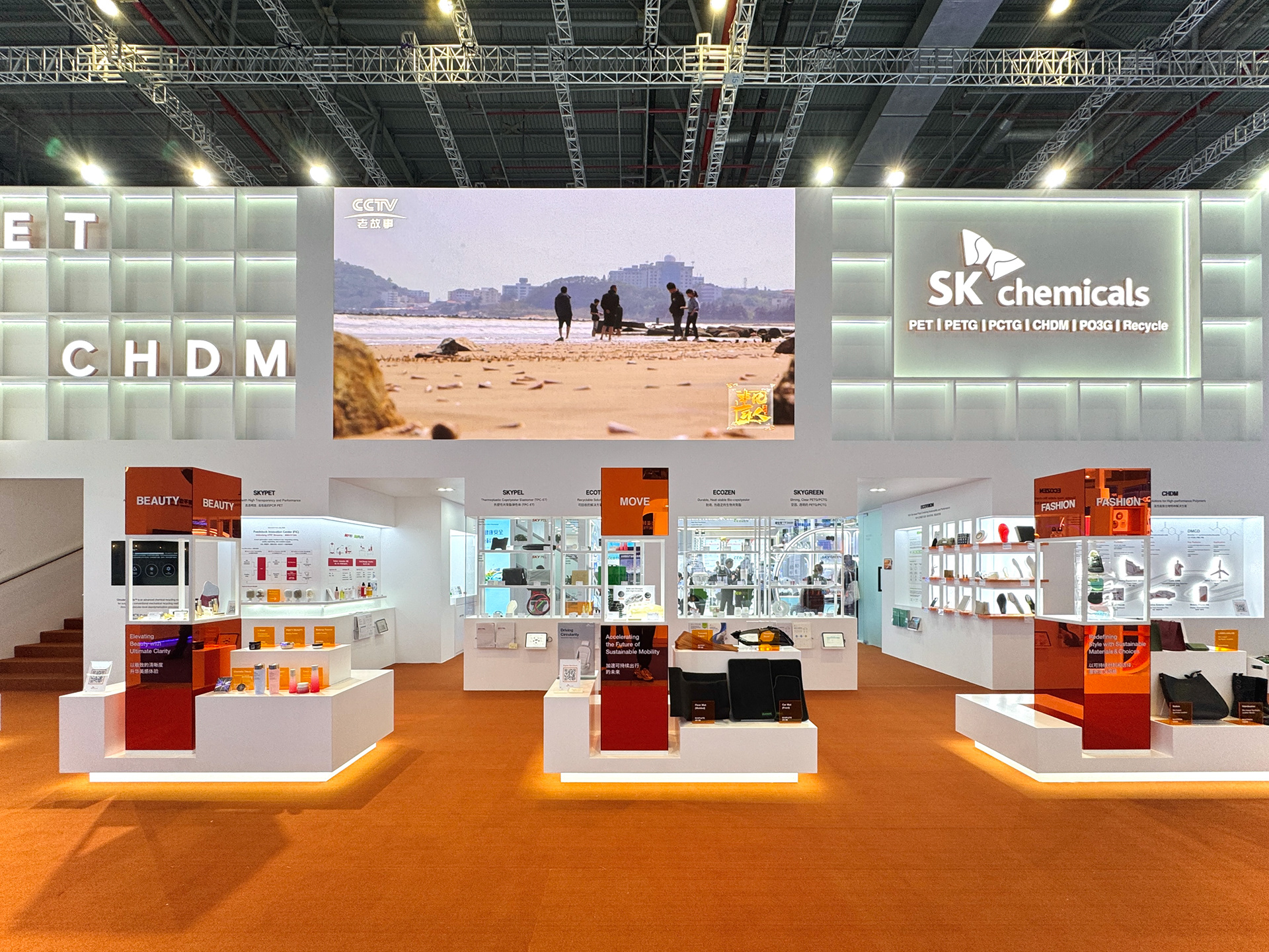
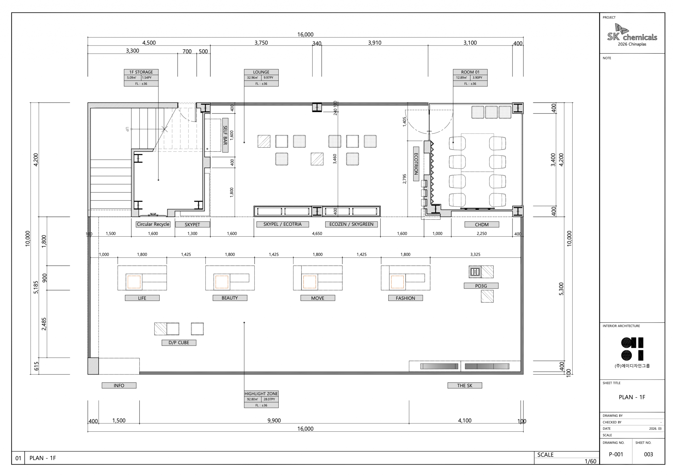
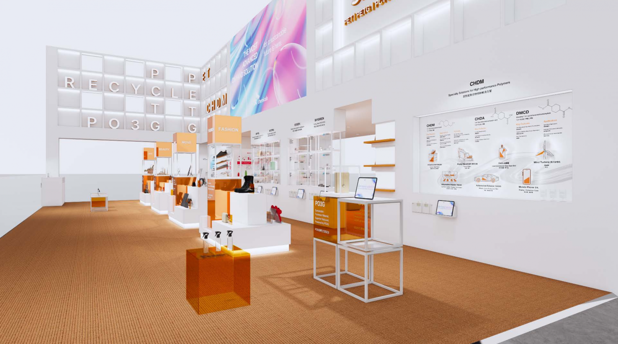
오렌지 투명·반사 패널과 내부 조명 선반으로 구성한 애플리케이션별 하이라이트 존을 전면에 배치하고, 후면에는 브랜드별 소재·기술 쇼케이스를 연속 구성해 적용 제품에서 핵심 소재로 이어지는 관람 흐름을 구현하였다.
Application-specific highlight zones, composed of transparent and reflective orange panels with internally illuminated shelves, are positioned at the front. Brand-specific showcases presenting materials and technologies continue along the rear, creating a clear viewing sequence from applied products to their core materials.
전면에는 주요 적용 분야를 집약한 하이라이트 전시를, 후면에는 브랜드별 소재와 기술을 체계적으로 소개하는 전시를 배치해 적용 사례에서 핵심 기술로 이어지는 단계적 관람 흐름을 구성하였다.
각 전시대에는 개방형 구조를 적용해 4면 어디에서나 주요 콘텐츠를 확인할 수 있도록 하고, 다양한 방향에서 진입해 자연스럽게 이동하는 순환 관람 동선을 확보하였다. 중앙에는 전시 제품을 함께 살펴보며 자유롭게 대화할 수 있는 캐주얼 라운지를 마련해 짧은 상담과 네트워킹을 지원하였다. 1층에는 다인원 상담을 위한 대형 미팅룸을, 2층에는 소규모 상담을 위한 미팅룸 2개를 배치해 상담 규모에 따라 공간을 활용할 수 있도록 하였으며, 일반 관람 공간과 분리된 독립적인 비즈니스 환경을 확보하였다.
The front of the pavilion presents highlight displays that consolidate the major application fields, while the rear introduces materials and technologies by individual brand. This arrangement creates a progressive viewing sequence that leads visitors from real-world applications to the core technologies behind them. Each display uses an open structure, allowing the main content to remain visible from all four sides of the pavilion and supporting natural circulation from multiple entry points. A casual lounge at the centre allows visitors to view the exhibits while holding brief conversations, informal consultations, and networking sessions. A large meeting room on the ground floor accommodates group discussions, while two smaller meeting rooms on the upper floor support more focused consultations. These enclosed meeting spaces provide business environments separated from the general exhibition and visitor circulation areas.

워드 퍼즐형 타이포그래피를 적용한 큐브 파사드 아래에 애플리케이션 전시와 브랜드별 쇼케이스를 연속 배치하였다. 투명한 오픈 프레임을 통해 제품과 후면 콘텐츠가 중첩되어 보이도록 구성해 전시의 개방성과 가시성을 확보하였다.
Below the cube façade featuring word-puzzle typography, application displays and brand-specific showcases are arranged as one continuous exhibition sequence. Transparent open frames allow products and background content to remain visible together, increasing both spatial
openness and product visibility from multiple viewing angles.

브랜드별 제품 쇼케이스와 인접한 공간에 오렌지 투명 아크릴 테이블과 이동형 좌석으로 캐주얼 라운지를 구성하였다. 관람객이 제품을 살펴보며 자유롭게 대화할 수 있도록 전시와 짧은 상담·네트워킹 기능을 결합하였다.
A casual lounge is positioned beside the brand-specific product showcases, using transparent orange acrylic tables and movable stools. The open seating arrangement allows visitors to continue viewing the exhibits while holding informal conversations, brief consultations, and
networking sessions.