


Design
Young-In space Co. ltd
E-Mail | hello@younginspace.com
Tel | 02-422-6403
Web | https://younginspace.com/
Designer | Young-In Space Co., Ltd.
Exhibition
The 48th session of the UNESCO
World Heritage Committee
Location | BEXCO
Period | 2026.7.19. ~ 2026.7.29.
Booth Size | 270(㎡)
Exhibitor
National Archives of Korea
web | www.archives.go.kr
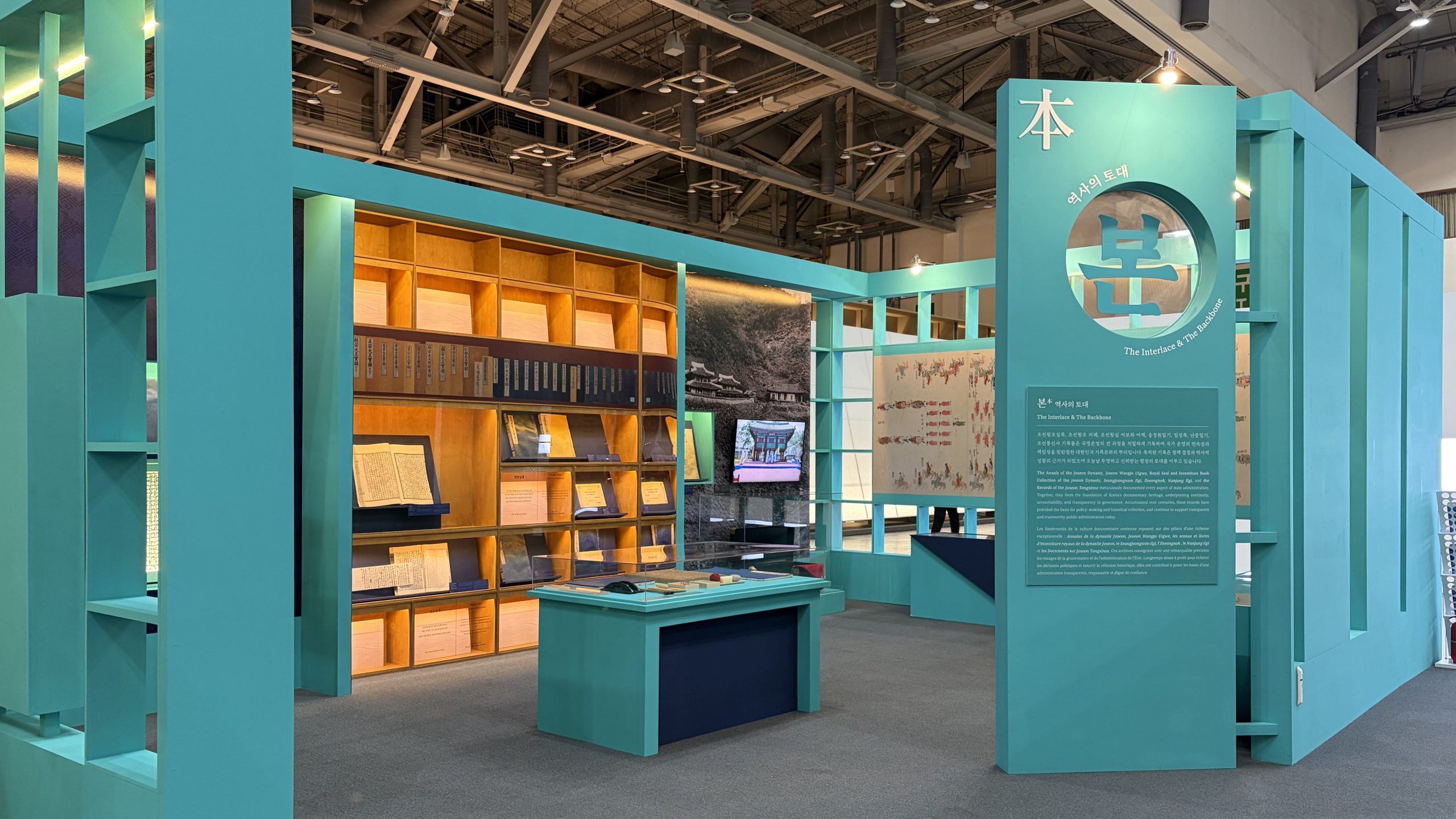
국가기록원이 보존해 온 세계기록유산을 단순히 나열하는 전시가 아니라, 기록이 시대를 만들고 사람과 사회를 연결해 오늘까지 이어지는 과정을 공간으로 구현하는 것을 핵심 콘셉트로 계획하였다. 전시는 본(本)·맥(脈)·민(民)·공(共)의 네 가지 키워드를 중심으로 구성하고, 중앙 공간을 중심으로 4개의 주제 공간을 연결하는 동선을 계획하여 기록의 역사적 가치와 사회적 의미를 순차적으로 경험할 수 있도록 하였다. 각 존은 주제별 성격을 명확하게 구분하기 위해 청록(본)·노랑(맥)·주황(민)·초록(공)의 포인트 컬러를 적용하고, 개방형 프레임 구조를 통해 시각적 연속성과 공간의 개방감을 확보하였다. 아카이브형 진열 방식과 연결 동선을 적용하여 관람객이 기록의 축적 과정을 자연스럽게 따라가며, 기록이 현재를 형성하고 미래로 이어지는 세계기록유산의 가치를 공간 속에서 이해할 수 있도록 디자인하였다.
Instead of merely listing the UNESCO World Documentary Heritage preserved by the National Archives of Korea, the core concept of this exhibition design is to create an immersive space where records shape eras, connect people and society, and continuously unfold into the present. The exhibition is structured around four primary keywords: Bon (Root), Maek (stem), Min (People), and Gong (Together). A central hub connects these four thematic zones in a seamless narrative flow, allowing visitors to sequentially experience the historical significance and social value of the records. To establish a distinct identity for each section while maintaining harmony, strategic point colors are assigned: Teal (Bon), Yellow (Maek), Orange (Min), and Green (Gong). An open-frame structural approach is incorporated across the layout to ensure visual continuity and an expansive sense of openness. Furthermore, by applying an archive-style display methodology along with interconnected circulation pathways, visitors are naturally guided through the cumulative process of record-keeping. Through this spatial narrative, the exhibition enables audiences to intuitively appreciate the enduring value of world documentary heritage—how records have formed our present and continue to pave the way for the future.
청록색 포인트 컬러와 개방형 프레임 구조를 적용한 세계기록유산 ‘본(本)’ 주제 존 전경. 아카이브형 서가 진열장과 아크릴 케이스, 중앙 아일랜드 진열대를 입체적으로 배치하여 직관적이고 몰입감 높은 전시 환경을 구현했다.
A general view of the Bon (Root) thematic zone for the UNESCO World Documentary Heritage, characterized by its signature teal point color and an open-frame structural approach. By creatively integrating archive-style library shelving, acrylic cases, and a central island display unit in a multi-dimensional arrangement, a highly intuitive and immersive exhibition environment has been realized.
전시 공간은 목재 각재 프레임을 기본 구조로 시공하고, MDF 마감 후 컬러 도장을 적용하여 4개의 주제 공간과 중앙 공간을 구성하였다. 기록물 전시는 아크릴 케이스를 사용하여 시인성과 보존성을 확보하였으며, 대형 그래픽 패널과 영상 디스플레이를 함께 배치하여 실물 기록물과 시각 콘텐츠를 연계하였다. 조명은 led 간접 조명으로 기록물과 주요 전시물을 강조하고, LED 간접조명을 벽면 상부와 매입형 진열장 내부에 적용하여 공간의 깊이와 전시 집중도를 높였다. 구조는 개방형 프레임과 연결형 동선을 적용하여 각 존의 독립성을 유지하면서도 관람객이 중앙 공간을 중심으로 자연스럽게 이동할 수 있도록 계획하였다. 또한 존별 포인트 컬러를 구조체와 전시 가구에 동일하게 적용하여 공간 구분과 주제 인지성을 높였다
The exhibition space was constructed using a wooden frame as the primary structure, finished with MDF panels and applied color painting to create four thematic zones and a central area. For the display of archival records, custom acrylic cases were utilized to ensure both maximum visibility and optimal preservation. Large-scale graphic panels and video displays were strategically integrated alongside physical artifacts to establish a cohesive connection between tangible records and dynamic visual content. The lighting scheme incorporates LED indirect lighting to highlight key documents and artifacts. Specifically, recessed LED strip lights installed at the top of the walls and within recessed display cases enhance spatial depth while heightening visual focus on the exhibits. Structurally, an open-frame layout with interconnected circulation paths allows each zone to maintain its individual identity while enabling visitors to move intuitively around the central hub. Additionally, zone-specific point colors are applied consistently across the structural elements and display fixtures, clearly reinforcing spatial distinction and thematic recognition.
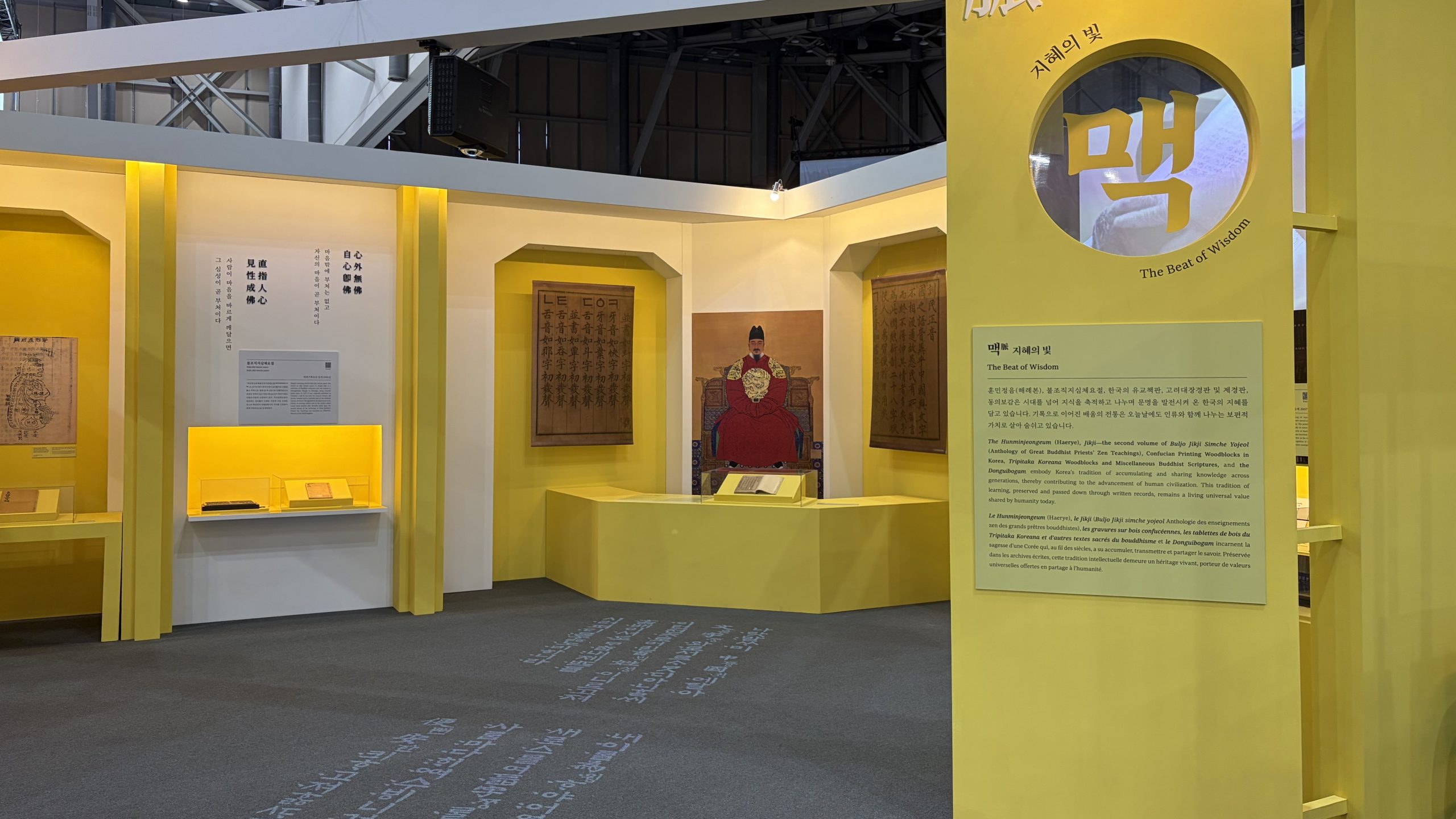
노란색 포인트 컬러가 적용된 세계기록유산 ‘맥(脈)’ 주제 존 전경. 훈민정음 목판 및 세종대왕 영정과 함께 벽면 매립형 진열장, 중앙 그래픽 연출을 입체적으로 배치하여 기록에 담긴 ‘지혜의 빛’을 효과적으로 전달한다.
A general view of the Maek (stem) thematic zone for the UNESCO World Documentary Heritage, accented with a warm yellow point color. By thoughtfully integrating key artifacts—such as the Hunmin jeongeum woodblocks and the royal portrait of King Sejong—along with recessed wall showcases and three-dimensional central graphics, the space vividly illuminates the theme of “The Beat of Wisdom.”
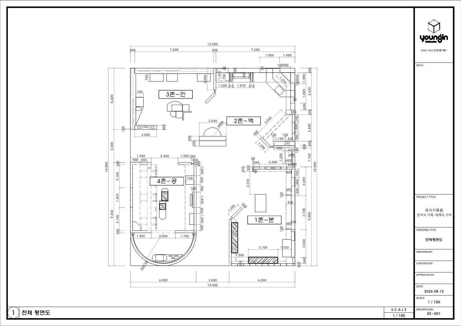
전시 공간은 중앙 공간을 기준으로 4개의 주제 존을 순차적으로 연결하는 순환형 동선으로 계획하였다.
관람객은 본(本)–맥(脈)–민(民)–공(共)의 순서에 따라 이동하며 세계기록유산의 흐름을 시간의 축에 맞춰 자연스럽게 이해할 수 있도록 구성하였다. 각 존은 독립된 전시 공간으로 운영하면서도 개방형 프레임 구조를 적용하여 다음 공간이 일부 시야에 들어오도록 계획해 이동 방향을 쉽게 인지할 수 있도록 하였다. 중앙 공간에는 사방에서 접근 가능한 독립형 진열장을 배치하여 관람객이 어느 방향에서든 관람할 수 있도록 하였으며, 각 존에는 벽면 전시, 매입형 진열장, 아일랜드형 진열장, 영상 디스플레이를 주제에 맞게 배치하여 다양한 관람 방식을 제공하였다. 또한 존별 포인트 컬러를 구조체와 전시 가구에 동일하게 적용하여 공간의 경계를 명확히 구분하고, 별도의 안내 없이도 각 공간의 주제와 관람 순서를 직관적으로 인지할 수 있도록 계획하였다. 전체 동선은 교차와 막힘을 최소화하여 다수의 관람객이 동시에 이동하더라도 원활한 관람이 가능하도록 구성하였다.
The exhibition space is designed with a circular flow around a central hub, sequentially connecting four thematic zones. Visitors move through the sequence of Bon (Root) – Maek (stem) – Min (People) – Gong (Shared Value), allowing them to naturally comprehend the historical progression of UNESCO World Documentary Heritage along a chronological axis. While each section functions as an independent display area, an open-frame structural design provides subtle sightlines into adjacent zones, offering intuitive direction and wayfinding throughout the journey. At the center, freestanding display cases accessible from all sides are positioned to allow multi-directional viewing. Within each thematic zone, wall-mounted displays, recessed showcases, island display units, and digital video screens are strategically arranged to offer diverse engagement methods tailored to specific themes. Furthermore, zone-specific point colors are applied consistently to the structural elements and exhibit furniture, clearly defining spatial boundaries and enabling visitors to intuitively recognize each theme and viewing sequence without explicit signage. The overall circulation layout minimizes intersections and bottlenecks, ensuring smooth traffic flow even during peak visitor hours.
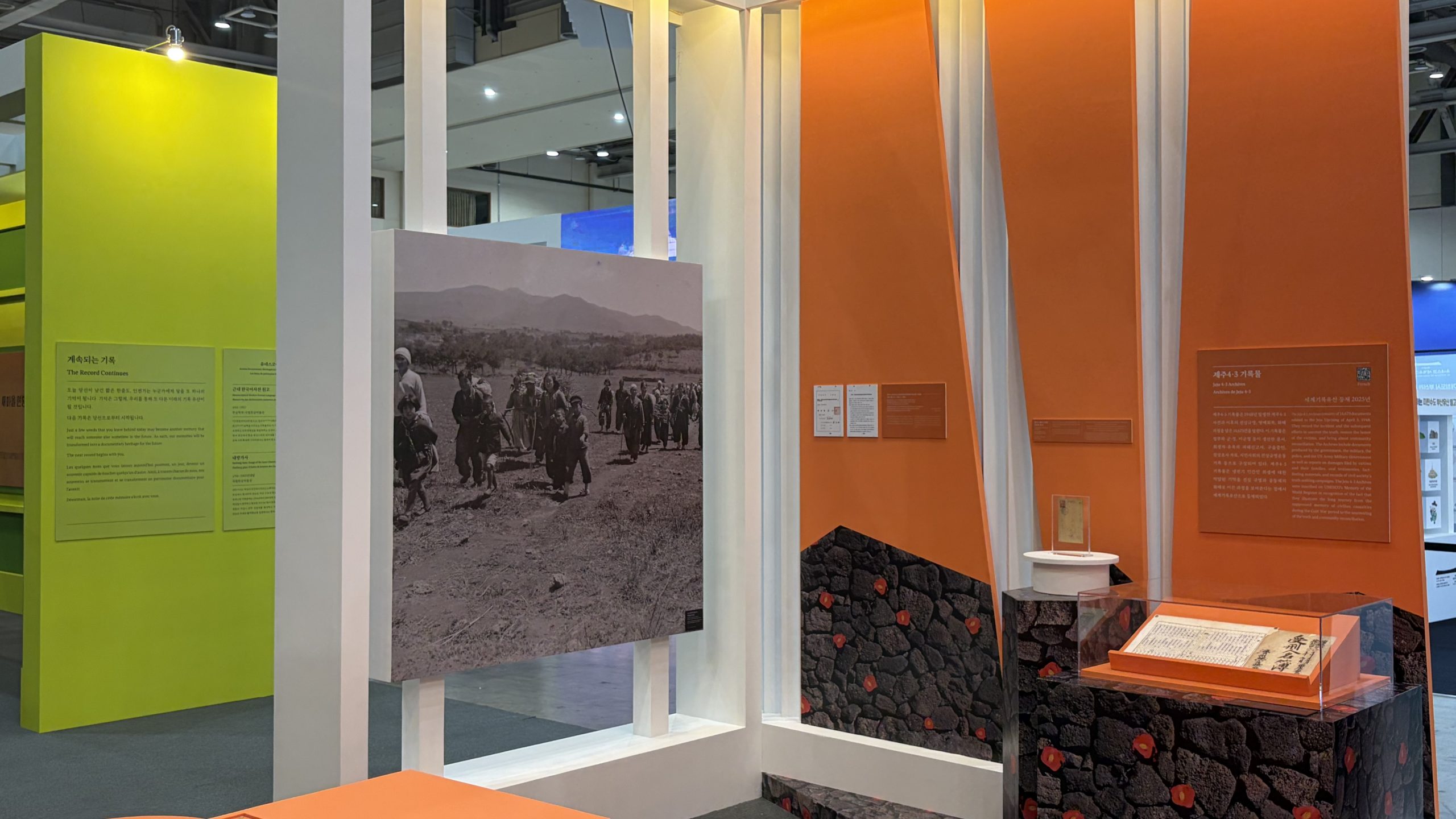
오렌지색 포인트 컬러와 개방형 프레임 구조를 적용한 세계기록유산 ‘민(民)’ 주제 존 전경. 민초들의 삶을 담은 대형 흑백 사진 패널과 동백꽃 연출이 적용된 독립형 진열대를 입체적으로 배치하여 제주 4·3 기록물의 역사적 가치를 효과적으로 전달한다.
A general view of the Min (People) thematic zone for the UNESCO World Documentary Heritage, featuring a vibrant orange point color and an open-frame structure. By multi-dimensionally arranging largescale black-and-white photo panels depicting common people alongside a freestanding display case with camellia flower motifs, the space effectively conveys the historical value of the Jeju 4·3 records.
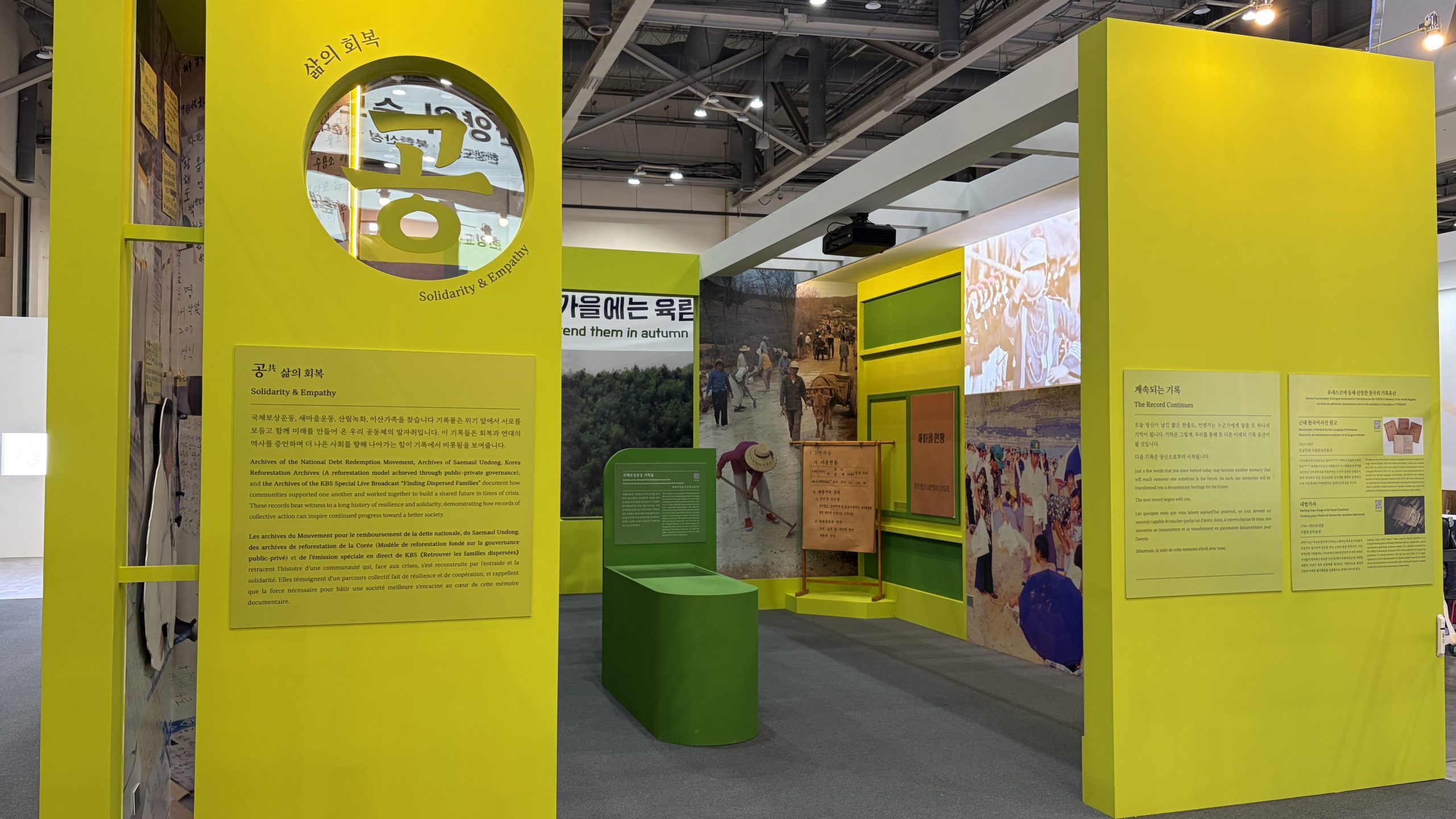
노란색 포인트 컬러와 개방형 프레임 구조를 적용한 세계기록유산 ‘공(共)’ 주제 존 전경. 대형 그래픽 패널과 매입형 패널, 독립형 집기를 입체적으로 연출하여 기록의 사회적 가치와 ‘삶의 회복’이라는 메시지를 효과적으로 전달한다.
A general view of the Gong (Shared Value) thematic zone for the UNESCO World Documentary Heritage, featuring a vibrant yellow point color and an open-frame structure. By multi-dimensionally arranging large-scale graphic panels, recessed displays, and standalone fixtures, the space effectively conveys the social value of historical records and the overarching theme of “Restoration of Life.”